 Disclaimer: Image heavy post.
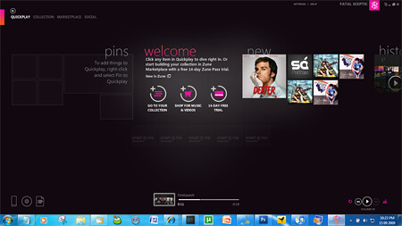
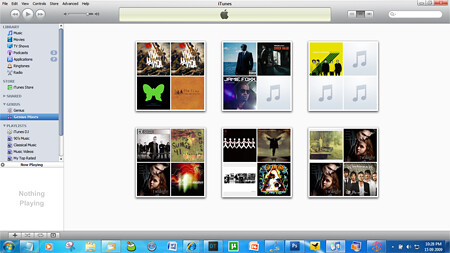
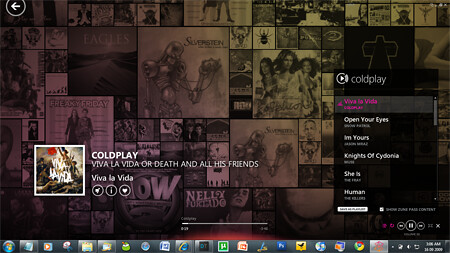
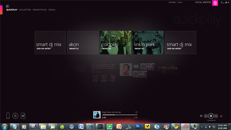
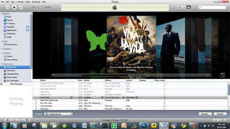
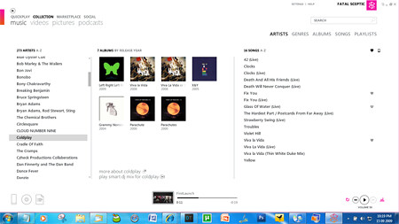
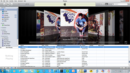
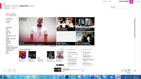
Call me a fanboy but here are some screenshots of both iTunes 9 & Zune 4. Have a look at the gorgeous UI the new Zune as compared to that utterly ugly iTunes UI. The Macboys should find Zune to their liking – borderless window. And this is not something entirely new. Zune desktop’s previous version was also way ahead in UI compared to iTunes. Screenshots:
Zune 4 Quickplay:
iTunes 9 Genius: (This is the only ‘good-looking’ screen in iTunes)
Zune 4 DJ Now-Playing: (These screens also go into Full Screen mode. Gorgeous!)
The flames below the track status bar is a visulization! Here’s another beautiful screen:
How can you not like such displays:
Zune 4.0 DJ Screen:
iTunes 9 DJ Screen:
Zune 4 Music Library:
iTunes 9 Music Library: (Coverflow a beautiful UI makes not.)
Zune 4 Marketplace:
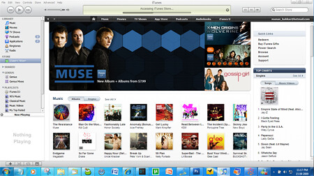
iTunes 9 Marketplace:
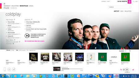
Zune 4 Marketplace, artist page:
iTunes 9 Marketplace, Artist page:
Edit: @aryayush pointed out that the image I had posted here before was of the search results and not the artist page. Corrected.
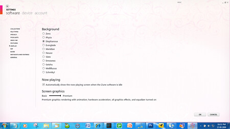
Zune 4 UI Themes:
Zune 4 Podcasts:
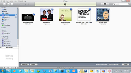
iTunes 9 Podcast:
Both players intheir minimal view:

Here is the Zune 4’s First Launch video, which again looks slick:
And the Zune HD vs iPod Touch comparison chart:
| Zune HD | iPod Touch 3 | |
| Display | 3.3 inch touchscreen, OLED | 3.5 inch touchscreen (no OLED) |
| Resolution | 480 x 272 px | 480 x 320 px |
| Color | Black, Platinum, Blue, Lime Green & Red | Black |
| Browser | IE Mobile | Safari |
| Software | Zune Firmware 3.0 | iPhone OS 3.1 |
| Capacity | 16 GB/32GB | 8GB/32 GB/64 GB |
| Price | $219.99/$289.99 | $199/$299/$399 |
| WiFi | Yes | Yes |
| HD Radio | Yes | No |
| HD Video Out | Yes | No |
| Wireless Sync | Yes | No |
| Input | Touchscreen keyboard and accelerometor | Touchscreen keyboard and accelerometor |
| App Store | Not yet | Yes |
Comparison Courtesy: QuickPwn





Damn you Microsoft.. this thing deserved to be launched in India..
If only I had a zune, I would be using Zune software as my default media player in Windows. Or if Microsoft releases Zune sync for Nokia phones…
But the Zune media format support still sucks as neither the player nor the software supports popular formats like DivX/Xvid/MPEG-4 Advanced Simple Profile, MPEG-1/2 and containers like AVI/MPG/MKV/FLV. That makes the player useless because all of my content is in these formats and I don’t want to pay for crap quality shareware converters which are available by the dozen.
Yeah that’s kinda a downer but not like iTunes does all of that ;) WMP 12 plays a lot of the formats & along with VLC at hand, I’m all good :) And I guess we can’t do much about the formats supported on the devices too much of politicals involved in the decision making and format support.
Hey ,
Still being ugly , it is mostly sold MP3 player and mostly used downloading station . I would say Microsoft first needs to reach a little near to the sales and download count before you call Itunes Ugly :)
Ratish
What is ugly … is ugly. The fact that it is widely used doesn’t mean that it is not ugly. ;)
I think that Opera software should develop Opera browser for Zune.. they can make it paid if they want.. it would be awesome to use that on it… btw.. does Zune HD has any email client?
Nope.
Considering India to be a huge market for microsoft, they should launch Zune HD here..!!
Nobody listens to HD Radio in the US. OLED sucks in day light. The interface might be cool…but Apple is supposedly revamping iTunes on the next update. Ugly? not really. Pretty? no, but it doe the job well. WMP is a resource hog. and you are comparing WMP to iTunes…not exactly apples for apples is it? Zune subscription sucks.
Oh, and MS is WAAAY behind the power curve on this.
I’m a big fan of MS. But they’ve been dropping the ball left and right for years in this area.
thanks for the great post, nice one.
Yeh, look at your fucking taskbar. Call me an XP fanboy, but that shit is ugly.
Oh my god… I am glad.I don’t have all this know-how about these kinds of things, or my little old Nano would drive me insane!But think both of it i will choose I-pod touch.
Person whose library screenshots are above seems to be using pirated music from “djluv.in”
anonymous
Zune does support those formats now dumbass why don’t you jsut give up Microsoft has once again out done apple
Dude you suck. iTunes and iPod beat the shit out of Zune. That’s just fact, and i’m sorry that your trying to deny it.
The Zune software sure looks good, but it takes a lot more clicks to achieve what I can do in the iTunes with fewer clicks. I can’t click more for the sake of beauty, no matter how much I love Windows and find Macs ridiculously expensive..
Trying it out now :D
Wheres the picture of Zune showing its library of Movies that you add to it. You know the ones you didnt buy off the Zune Marketplace.
Ill tell you why you didnt show it becuase its ugly as hell. You dont have cover art for your own movies.
I wont buy a zune till microsoft fixes this crapware.