[Early Screen Shots] Evolution Of The Bing Homepage Design – Kieg, Kumo, Kiev, Kumo
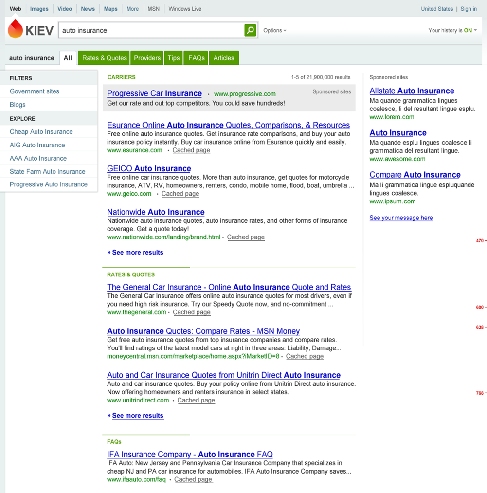
 MIX10 has ended (at least the fun stuff), a ton of information regarding Windows Phones, Silverlight, IE9 is keeping everyone busy. While scrolling through the list of sessions to download them, I came across one dealing with the designing of Bing. Bing was initially known as Kumo and it seems that there were a two more codenames within Microsoft while they were racking their brains over how their new search decision engine should look like. The final design of Bing page was an improvisation of the following 5 designs, in the given order:
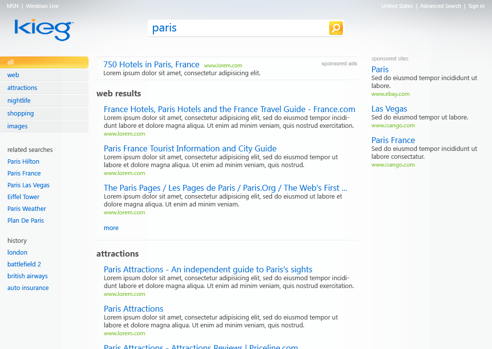
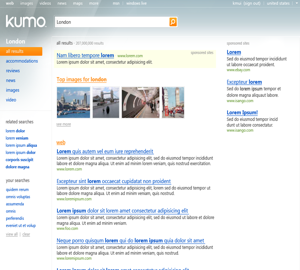
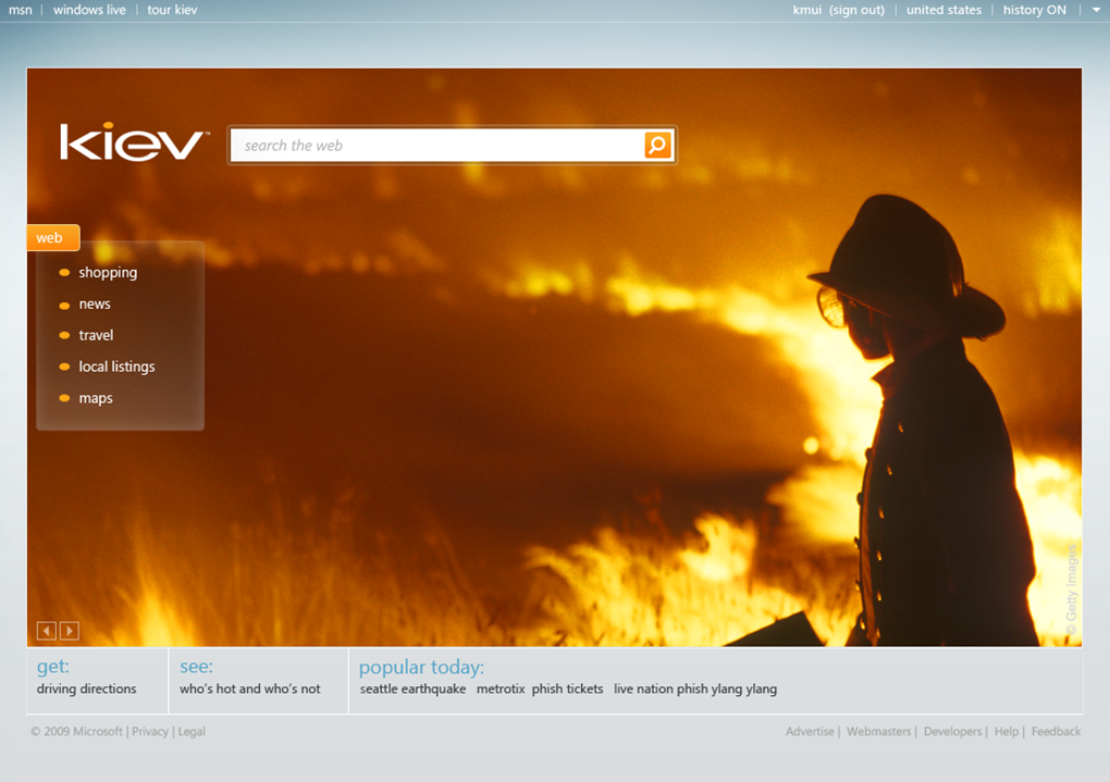
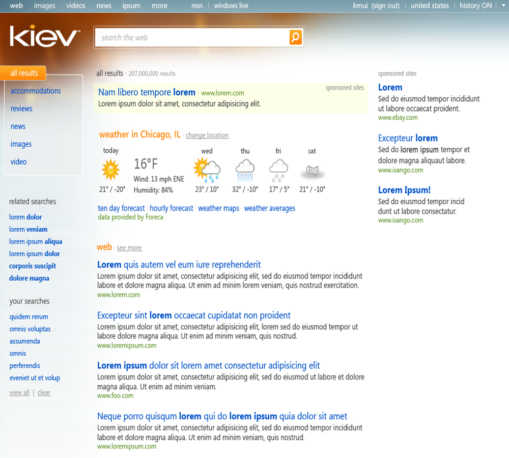
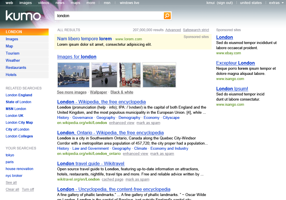
We can see how it started with a silver background, then came in the background to the home page and the background was added to the top-left corner of the search results page. The logo of Bing is Bing written in Kieg/Kiev’s typography. Some other nascent design iterations:

Here’s a good read by Ina Fried at Cnet with Brian MacDonald who worked on what is now Bing.